")
")
")
")

This article looks at the money movement in different US sectors for January 2024 and how it might affect the markets in February 2024. This is important because when the rate of money flowing into the economy changes, it takes about a month before it affects the stock market and other types of investments. This can help predict how investments will perform in the future. Other big financial movements can show what might happen in many months or years.
The table below shows the sectoral balances for the US which are produced from the national accounts.
US Treasury and author calculations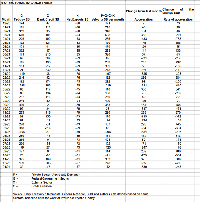
In January 2024, the private sector recorded a deficit of $52B and this is a negative result for asset markets as financial balances in the private sector have fallen and reversed aggregate demand and the demand for investment assets.
From the table, one can see that the $52 billion private sector funds deficit came from a $32 billion injection of funds by the federal government (and this includes the new injection channel from the Fed of around $11B from interest on reserves that went directly into the banking sector), less the -$67B billion that flowed out of the private domestic sector and into foreign bank accounts at the Fed (the external sector X) in return for imported goods and services. Bank credit creation went backward by $17B in that more loans were repaid or written off than were created.
The chart below shows the sectoral balance data plotted in nominal terms. The calculation is federal government spending or G, plus the external sector (X and usually a negative factor) to leave that amount of money left to the private domestic sector, or P, an accounting identity true by definition.
US Treasury, SPX and author calculations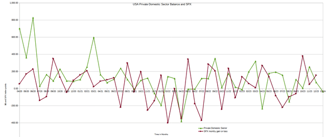
Last month the chart predicted a continuation of the rally into January and that January would close higher than December and this did indeed happen. The amount of the increase month over month was stronger than expected and most welcome.
This month the lead of the private domestic sector balance over the (SPX) predicts that the (SPX) will finish February lower than it began. Please see the seasonal stock market index comments below for more information on short-term stock market movements.
The following chart emerges when one graphs the change rate of the information in the US sectoral balances table above and adjusts for impact time lags. This is like a long-range market radar set.
Mr. Robert P Balan of the Predictive Analytic Models Investment Service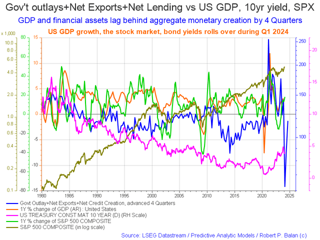
The blue line shows the fiscal impulse from federal government outlays plus bank credit creation and less the current account balance and leads by up to four quarters. The change month over month is that the blue fiscal flow line is heading back up again and the bottom of the trough that it is rising from is roundabout now and it is pointing to a good 2024 for most of the year.
The chart below shows the five-year average of the seasonal stock market patterns for the SPX (SPX), Nasdaq (NDX), Dow (DIA), Russell 2000 (RTY), and Biotech (IBB) market indexes. The chart has been updated and has a slightly different format than last year.
Naturally, as we are now in a new year the 5-year averages are updated. The result from 2023 is added and that from 2018 is taken away. A trading year has about 260 trading days in it and the X axis shows this and in previous years ran from trading day 0 to trading day 260. We would normally now revert back to zero and begin the process again using the new averages.
This year the old data from 0 to 260 has been retained and the first 60 trading days, or about three months of new averages data added onto the end of it. At the time of writing it would normally be trading day 30 however under the new system it is trading day 260, though both sets of data are helpful when one looks at the averages at TD 30 and also TD 260 which are the same points but in different years.
Mr. Robert P Balan of the Predictive Analytic Models Investment Service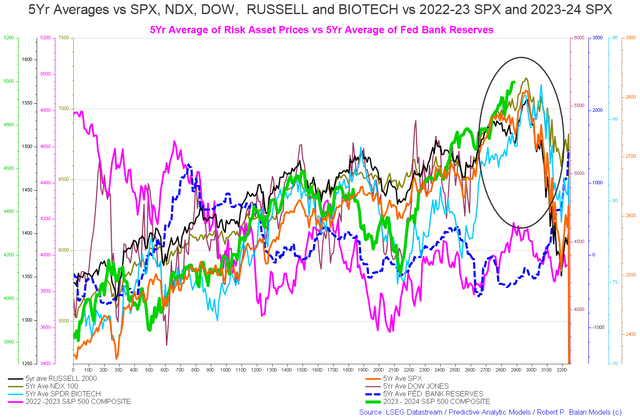
Last month the orange line on the chart above, the 5-year average of the (SPX) predicted some initial weakness going into January until about trading day 10 (12th of January) and then rose in steps up to about trading day 25 (2nd February) whereupon it falls to a local seasonal bottom at around trading day 30 (about the 9th of February and the time of writing this report). So far the local seasonal bottom has not occurred and the index averages are still driving upwards and onward. The local seasonal low still has time to develop over the next few days and could well do so.
The end of the green line is the (SPX) and shows where we are at the time of writing. The index averages predict the markets will roll over and decline from trading day 290 onward and continue to do so through February and into March in a grand decline that may last until trading day 320 which is about the 22nd of March.
This is not a rosy short-term prognosis.
The table below shows the total federal government withdrawals from their account at the Federal Reserve Bank. A withdrawal by the federal government is a receipt/credit for the private sector and therefore a positive for asset markets.
US Treasury and Author Calculations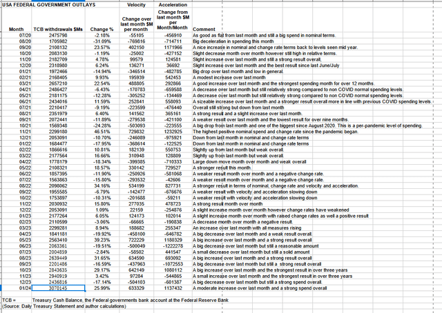
The table shows that total outlays were an increase over the previous month and a very strong $3T+ and the largest for over three years. The problem was that Federal taxes, fees, charges, and bond turnover allowed only $32B of that spending to remain in the private sector and form the federal deficit which is dollar for dollar the private sector surplus. When one deducts the current account deficit from this result the private domestic sector balance is minus $35B. It gets worse again when one deducts the negative bank credit creation.
Mr. Nick Gomez, ANG Traders of the Away from the Herd Investment Service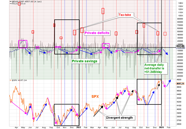
The chart above, top panel, highlights in red and green the financial relationship between the currency creator (red area and the federal government) and currency users (green area the private sector). This chart shows federal spending net of bond turnover and is likewise pointing to lower markets in the short term due to the lack of federal spending and would be shown lower still if the current account deficit were taken into account.
- The February start-of-the-month payments produced a +$72B net transfer and the average daily net-transfer rose to +$1.78B/day, which is still significantly lower than last year at this time (+$3.65B/day).
- The nominal spending is $145B higher than last year at this point: $2,363B compared to $2,218B last year. But the net-spending (spending minus taxation) is slightly lower this year: $483B compared to $488B last year. This is because of increased taxes that resulted from increased economic activity (higher individual and corporate incomes).
- The quarterly interest payment, coming up on February 15, is expected to mark the high point of the fund-flows until after the April tax-take.
- Even though FOMO has been pushing the market higher, the upcoming March and April tax-takes could provide a ‘buy-the-dip’ opportunity.
(Source: Mr. Nick Gomez, ANG Traders, Weekly Report for Subscribers the Away from the Herd SA Market Service).
Mr. Nick Gomez, ANG Traders of the Away from the Herd Investment Service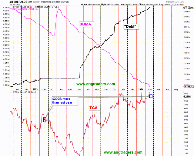
The chart above shows the general conditions of the stock of treasuries rising and the SOMA (Fed balance sheet) falling.
The next major fiscal milestone is a boost to fiscal flows from a treasury coupon interest payment on the 15th of February and then in mid-April there is a large federal taxation event that will remove funds from the private sector. Perhaps way more than normal.
The April tax take could be unusually large as it is rumored the Internal Revenue Service has installed some remarkably effective software that has lifted its collection efficiency as the quote below illustrates:
Twitter, X.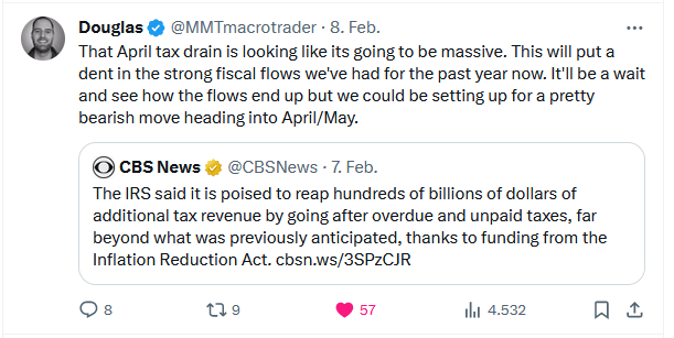
While more federal government spending is always welcomed sometimes it goes in the wrong place and leads to less overall.
This comes back to the wise words of Federal Chairman Beardsley Ruml and his 1946, economic Rosetta Stone-like essay entitled Federal “Taxes for Revenue are Obsolete”.
Generally speaking, February is a big spending month and this generally results in a strong stock market result as a seasonal pattern right through to the next local seasonal low at trading day 55 on the old chart. This year is shaping up differently.
At the White House in the last month, there was a Bipartisan agreement to extend tax cuts which is a good thing as this leaves more money in the private sector.
There was further student debt relief which again leaves more money in the private sector and has become an ongoing theme with this President as if he wishes to undo the great wrong that he did nearly 20 years ago.
theguardian.com/us-news/2019/dec/02/joe-biden-student-loan-debt-2005-act-2020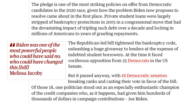
Source: The Guardian
Which then leads to this great quote from Professor Bibow on the mechanics of student debt and the choice open to young people in the USA:
The first important choice facing young people in America is getting an expensive education or not. Non-college-educated American workers are mostly stuck in mediocre or low-paying precarious jobs; with only a soft and patchy social safety net providing cover. They are simply forced to work a lot to make (often fairly low) ends meet, and often not even that. Skilled workers might get lucky by either having rich parents or landing a high-paying job straight away. Otherwise, they start their work life with a ton of debt, leaving them with three post-education options: join the conventional struggle to work a lot, possibly a lot more than they might want to, move in with their parents (to save on basic needs), or join the growing army of the homeless. From the very start of a standard work life, loading up on debt in uber-financialized America is the engine that puts the pressure on workers to work a lot (as modern “debt slaves”).
(Source: Economic Possibilities for Our Grandchildren-90 Years Later by Jörg Bibow Levy Economics Institute of Bard College Skidmore College January 2024 wp_1038_.pdf (levyinstitute.org)
The next Fed meeting is in the middle of March where most likely rates will be paused or raised slightly. The article I wrote last month has an in-depth look at the impact of a rate rise or pause. At the last meeting, they paused but I do not think they are finished though the rate of increase is slowing.
It is important to review the housing market regularly because the housing cycle is the business cycle and is nearing its 2026 peak.
Mr. Robert P Balan of the Predictive Analytic Models Investment Service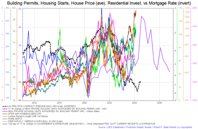
The chart above again shows aspects of the housing market. In this instance, we have the price of lumber (orange line and that tends to rise in a boom) appearing to bottom and be close to a local low. Now all rising are the home-builder ETF (NAIL), Home Depot (HD), housing starts, and permits. Important to note though is the purple government expenditure line that is due to put in a local bottom in early 2024 before rising through most of the rest of 2024 before dropping and rising again into 2025. This line is the fiscal carrier wave that sets the overall trend for all other waves that follow in its wake and is shown as a blue line in the second chart in this article.
The grand decline mentioned at the start of this article that sees asset prices lower in March follows this line downwards. The good news is that after the March decline, all indicators are that markets rise strongly after that.
Another very important macro trend that has become clear is the US working-age population is trending back upward after 20 years of trending downwards.
From the chart one can see that big change rate drops in the working-age population often precede recessions.
FRED with Author markups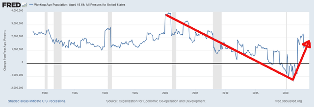
One cannot overstate from a first principles perspective how important this change of trend is. The fact that we are going to have a greater number of people working, earning, spending, producing, and demanding more goods and services underpins asset markets and will lead to the upswing that is coming after March this year to be very strong and sustained and probably peak in 2025 as per the chart below.
Mr. Robert P Balan of the Predictive Analytic Models Investment Service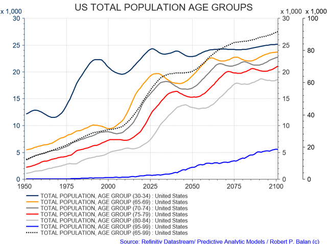
Notice how the population cohorts peak just after 2025. The last time it bottomed was in 2010 at the trough of the GFC. The chart is predicting that the bottom of GFC II will be about 2030.
Read the full article here
")
")
")
")
")
