


")
")

Our January Forecast of an August Top
Last January, we forecast an August market top, based on the idea that this bull market would last about the same amount of time as recent bull markets. The chart below, with green boxes showing equal time, is from that article. The right side of the current box is the end of August, so we’re one month away.
This, plus the extreme level of bullish sentiment and shrinking number of new highs, strongly suggests we’re starting the topping process of this bull market.
Similar Length Bull Markets (The Sentiment King)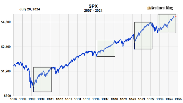
I often call it the murky period. It’s the period of transition from a bull market into a major correction. Someone once said, “Market turns are as obscure while they’re occurring as they are obvious after they’ve occurred.” This is very true.
Schematic of A Distribution Market Top (Sentiment King)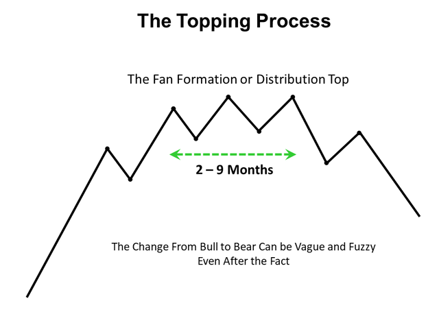
Is the Change From Bull Market to Correction Sudden or Gradual?
People think there’s a sudden switch from bull market to bear market. In their minds, the bull market ends when a price index makes its high, then the bear market begins and prices decline 15% to 20%, or more.
In truth, there’s usually a transition period, a grey area between the two; the changeover is not sudden. These transitions can often last from two to nine months, a few even longer. The basic pattern is diagrammed above.
Bull market tops are usually large fan formations that spread out over time. They’re often called “distribution tops.” Different sectors and stocks peak at different peaks in the broad index. You can often see this narrowing of participation in the declining number of stocks making new highs.
This vagueness makes it difficult to define the exact top of a bull market, since there’s a different top or starting point for each stock.
Let’s look at some examples.
The End of the 1995 to 2000 Bull Market
This chart shows the end of the 1995 to 2000 bull market. It’s easy to see the fan formation that formed during the first eight months of 2000, shown by the green arrow.
The 2000 Market Top (The Sentiment King)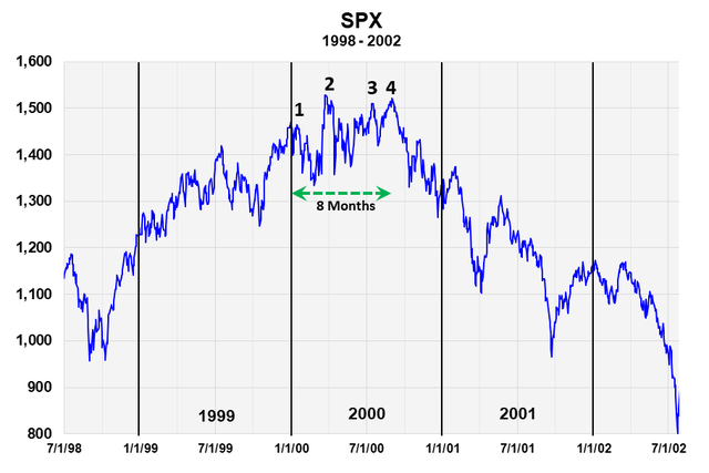
We’ve numbered four price highs during the period. Different stocks and sectors peaked at these different highs over the 8 months. The high price in the index occurred at point 2, but you can see that the bear market didn’t start until peak 4.
It was really a triple top in the S&P 500. By April 2001, prices were down 27%. They continued down into 2002. All this is only clear from hindsight, but it was all very confusing to go through real time.
The End of the 2003-2007 Bull Market
This next chart shows the end of the 2003-2007 bull market. The bear market that followed turned into the 2008-09 financial crisis.
The 2007 Market Top (The Sentiment King)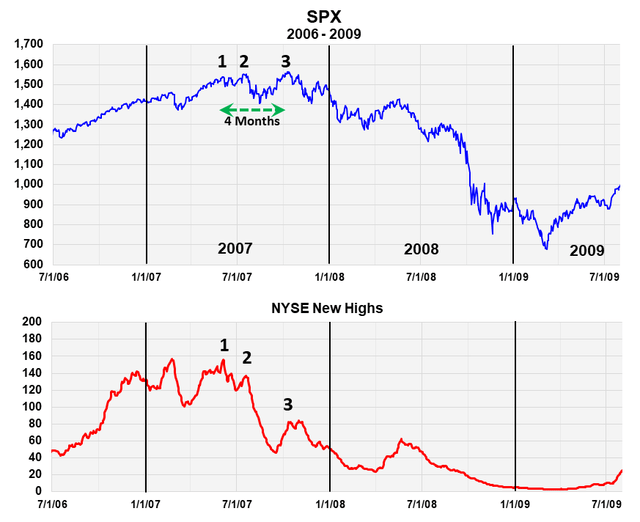
Here, the fan formation, shown by the green arrow, lasted about four months and had three distinct price peaks. We’ve marked these three points on the new high index, which shows that fewer and fewer stocks participated when the S&P index made peaks 2 and 3.
While the index essentially “double topped” over four months with points 2 and 3, a large number of sectors and stocks had already made their highs.
The 2015-16 Intermediate-Term Correction
This last example shows the same vagueness of transition even when the correction is not officially a bear market. It’s the 1915-16 correction shown below.
In this case, the distribution top, or fan formation, takes place over seven months. It has four distinct peaks. The number of new highs shows that by peaks 3 and 4, half the stocks had already made their highs. The subsequent correction took place in two selling waves that lasted around seven months.
There was a large rally (point 5) in between. An Elliott wave theorist would call this entire seven month correction, with the strong rally in between, a large ABC flat.
Overall, the S&P 500 declined about 15%, which is not officially a bear market.
The 2015-16 Market Top (The Sentiment King)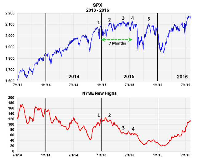
The Current Market
This is the current market and a schematic of what it would look like if it went through a normal topping process followed by a correction (green dashed line). A narrowing of participation has been occurring since March, as shown by the three insert numbers in the new high index.
The Current Stock Market (The Sentiment King)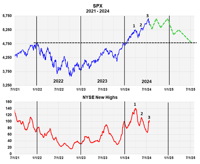
We estimated a distribution top lasting four months, which would take us to the end of the year. Then prices roll over and begin the correction. We’re expecting a 17 ½% price correction in the S&P 500 that takes us back to the 2021 high shown by the black, dashed line.
Of course, it’s highly unlikely the market will unfold just as we’ve diagrammed, since markets are too uncertain for that. But the schematic does contain the essence of what we expect. Given the extreme level of bullish sentiment, we strongly believe a significant correction is needed before another large price advance is possible, and think this schematic is as good an outline as possible.
Extreme Levels of Bullish Sentiment
As we said, what gives us confidence in this forecast is the extreme level of bullish sentiment that our Master Sentiment Indicator is showing. We wrote about this in this July 24th article.
On July 19, this indicator, which is composed of nine sentiment indicators, registered one of its most extreme bullish sentiment readings in fifteen years. The chart from that article is shown below. Historically, this is a very bearish signal.
The Master Sentiment Indicator (The Sentiment King)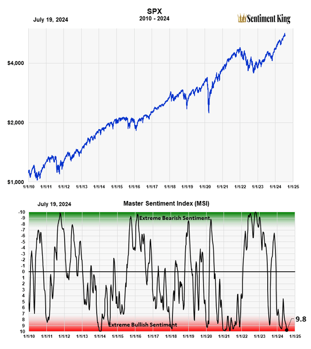
Why I Never Go Short a Bear Market
These charts subtly highlight why we never try to “short” a bear market. It looks easy in hindsight, but it’s far too difficult in practice. During a bear market, there are far too many false starts and strong rallies that make you doubt your short position. No system that I know of can prevent numerous whipsaws. There are also inherent carrying costs that erode any gains that long positions don’t have. Even going heavily into cash presents its own emotional pressure of “missing the bottom” anytime there’s a strong bear market rally.
The method we use is dynamic asset allocation, which is full diversification with emphasis on cash, then bonds, then stocks in that sequence. Bonds often rise during the worst part of a bear market, partially offsetting the effects of the bear market. There are other exotic strategies that can work, but they often come with other risks.
Read the full article here


")
")
